Taras Neporozhniy Senior Research Engineer
How a Design System Can Drive Unified Interface Development
- #Web
• 9 min read
Introduction
Initially, the entire public web presence of the company was just the macpaw.com website, with all its interface components described right in the website repository. Within several years, MacPaw and Setapp teams created several UI kits.
Let's consider problems with the current UI kit(s), find design mismatches with the company brand or even within the same product, and discuss how we could fix the situation.
Flexibility in adopting new technologies — still there?
Companies create their own UI kits and Design Systems to restrict and align the visual variety of the same interface elements.
Due to tight release deadlines, the current MacPaw UI kit was created in mind with fast integration into the project and thus consists of React components only.
But should the UI kit limit the technical implementation for future projects?
Someone might think: hey, but React is the de facto standard of our industry — all major company projects use it, and it's pretty much the web standard for today. Fortunately, this is almost true. Several MacPaw projects use non-React stack: PHP templating engines, WordPress, Webflow, and Svelte.
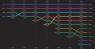
The latest 2022 framework interest statistic proves that React is not the only framework that is gaining popularity:
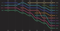
Although, it is undoubtedly the usage leader for now:
By sticking to a certain technology at the level of UI components, we become less agile and ready to adopt innovations. Rewriting the UI components to some new technology makes it difficult to adopt new frameworks. Maybe too difficult to even try.
Design System controls the design, Tech Radar controls the technology. It would be nice if the new core of UI kit exports consisted of basic technologies only: HTML, CSS, and JavaScript. That doesn't mean there can't be SCSS or Typescript under the hood.
Basic technologies exports provide an opportunity to integrate the UI kit in a modern framework technical stack, like those of the MacPaw and Setapp websites, and into site builders like WordPress or Webflow.
Frameworks like React or Svelte can have wrappers around these core exports, the so-called adapters, to prevent boilerplate code and speed up the integration of the UI kit into products.
Cross-team code sharing with a single base UI kit
All website components have the same functionality: buttons are pressed, sliders are moved, date pickers select dates, and notifications appear. They differ only visually. Many components, such as notifications (we do not talk about system notifications here), range sliders, accordions, tabs, and breadcrumbs, do not have HTML primitives. Cross-team code sharing prevents the creation of such components from scratch by each team individually.
Consider such a simple HTML element as a <button />: if an optional attribute type of the <button /> tag isn't set to thebutton value, this <button /> element performs submit action on click. Pressing such <button>Cancel form</button> element in some cases (like a broken JavaScript handler) can submit this form instead.
Another well-known bug/feature is the iOS auto zoom-in while focusing on <input /> with font size less than 16px. After losing focus, the page is not zoomed-out automatically. Users must double-tap the page or use multitouch gestures to return to the initial scale.
With an approach where each team has its own UI components implementation, they should fix these well-known and new bugs on their end. Different teams do not share this experience by default; knowledge sharing depends on team members being proactive.
In contrast, a cross-team UI kit fixes bugs in one place, has a larger audience for potential bug detection and accessibility, and tests are done once (excluding tests for framework adapters).
This article does not recommend how to implement the new solution technically. Rather, here we highlight the problem. As mentioned above, low-level technologies (HTML, CSS, and JS) are preferable for the core of the UI kit. It should also export adapters for the most common frameworks in the company.
Describing the differences between products with the CSS variables only is desirable. This approach may not work, but at the moment, it is difficult to say something about technical implementation until common parts and differences are found.
Company brand and sense of wholeness
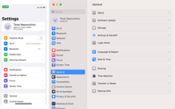
Looking at Google, Atlassian, or Apple products, we recognize the company behind them without unnecessary labels. In the case of the latter, macOS more and more shares the same UI elements with iOS:
Mac mini has had the same shape and size for more than 10 years:


Even products that are entirely different in purpose have common design elements, such as a corner radius:

The automotive industry also embodies brand design in its products. Cars of completely different classes, from coupes to SUVs, have common details:

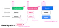
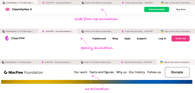
Let's find UI style inconsistencies in the following websites: MacPaw, ClearVPN, and MacPaw Foundation. We will consider only a few examples.
Not only buttons have different dimensions and behavior:
and floating top bars have 3 different appearance animations:
... but typography, input fields, carousels (e.g. reviews or mentions), modal windows and so on differ too!
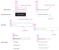
Now we check out Setapp product pages and Setapp User Account:
It's not just a difference in pixels. It is x2 or xN work time for designers and front-end developers. This is the time that teammates could have spent otherwise: paying more attention to details, refactoring something, or just drinking coffee and chatting in the kitchen. To some extent, these are also the pixels that the company spends extra money on.
It is worth noting that we are not talking about the difference in illustrations or colors. This may be the unique design difference that distinguishes the Porsche Coupe from the SUV — what the user really pays attention to.
Towards the universal UI kit
One of the tasks of the new Design System is to find what makes sense to do differently and what is the identity of the product.
A standalone team to the rescue
We propose an approach that is used in other companies like PandaDoc with a standalone UI team. The new team (let's call it the Design System team) consists of at least one designer and one front-end developer.
Design System team is the defender of the integrity of the interface. If a custom change in the UI bypasses the UI kit, there must be a good reason for it, like an A/B test. After a successful test, the change either becomes general or, otherwise, the team removes it from the product's code.
Front-end developer skills should be more broad than deep. There will be no experience in network requests, caching, or security. But a good knowledge of basic web technologies and at least shallow experience with several front-end frameworks is a must.
Every product designer should have a convenient way to use these shared components in design tools like Sketch or Figma. Every front-end developer should have a convenient way to use these shared components in code.
Integration into products of the Universal UI kit should in no way be more complex than creating a custom solution for product teams.
Moving from many frameworks to one
The transition process should have several stages.
First, the Design System team designer, with the help of product designers, will find all common UI elements and those that have differences. Find all states of these components: hover, pressed, focused, and alike. Basically, determine what affects the product's identity and what does not.
Some products have been developing for many years, and their design has passed several split tests. It is unlikely, but any small unification, such as the button's corner radius, may affect the conversion. For this reason, all changes must pass the A/B test or be under the supervision of an analyst.
If the unification fails, these differences should be considered a product feature and must be represented as variables at the code level.
Next, the Design System frontend developer discusses with other product teams frontend developers the final result and more specific details, like what the final result will be and how it will be integrated to products (for example, use plain CSS file include or create a framework adapter).
The Design System developer provides technical support for their implementation, such as bug fixes.
Product designers can suggest new components or changes to existing ones. These changes will hit all products immediately after the UI Kit package version upgrade.
Conclusion
The problem of the heterogeneous web UI frameworks is already affecting us, and both complicates maintenance of products and complicates adopting innovative solutions.
There is a clear need for a single source of truth both on design and implementation levels, and we show how a small dedicated team can solve most of the pain.
The final result, say, a macpaw.design resource, can combine such projects as ui.macpaw.com, fixel.macpaw.com, style.macpaw.com, Setapp UI kit, and MacPaw brand into a single one.
This is an independent publication and it has not been authorized, sponsored, or otherwise approved by Apple Inc, Porsche AG.