Alona Korolova Creative Service Manager 
Maksym Kukurudziak Head of Design Operations
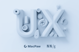
Fixel Font by MacPaw: The Essential Typeface with a Human Touch for You
- #Fonts
- #Typefaces
• 9 min read
We at MacPaw, in collaboration with a Ukrainian font studio AlphaBravo, created our own corporate typefaces and named them after cats that live at our office: Fixel and Hoover. We made Fixel Font completely open to the public as an attempt to share our strong typographic culture with the design community. As for Hoover Font, we want to keep it to ourselves to express our brand voice. Let’s dive into the story of how we created our outstanding typefaces.
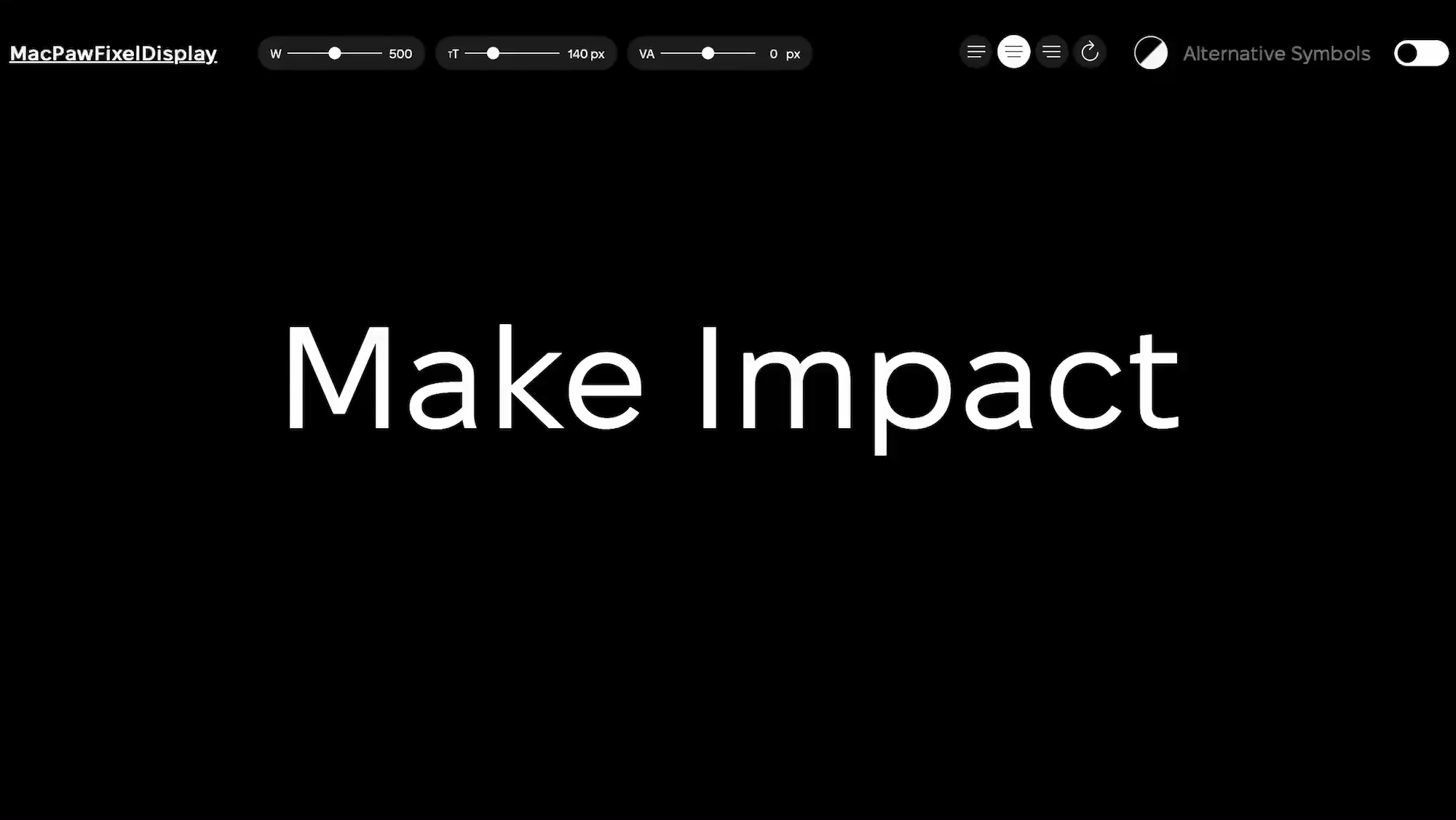
Fixel is a grotesque typeface with a human touch. It combines clarity and functionality with friendliness and dynamism.
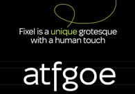
Fixel’s most distinctive feature is a unique combination of geometric and humanist grotesques, which results in open letter forms, wide width, crisp edges, and low contrast. The idea was to find a balance between restraint and playfulness.
We intentionally refrained from being overly expressive: such a design makes it useful with large volumes of text. Still, we added a few distinctive touches, such as gorgeous “a” and “g” letters to make our Fixel stand out. In addition to the standard set of letterforms, the typeface also includes alternative symbols that have increased dynamics and asymmetry.
Fixed is presented in two variants: Text and Display. Text is used for paragraphs where you’d get into more detail, while Display is for moments where you really want to stand out.
There are also nine weights from Think to Black so you can find the most effective way to express yourself.

Inspiration for typefaces
Let’s take a step back and see where it all started. Meet our beloved cats: Fixel (the striped one) and Hoover (the white one).
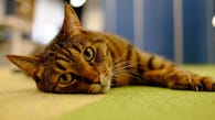
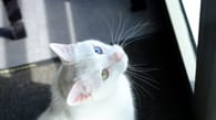
Fixel has been living at MacPaw for over ten years since he was a kitten. Our CTO, Vira Tkachenko, actually found him in a basement. Hoover joined our family in 2014.
If Fixel is more serious, independent, and straightforward, Hoover (white) is playful and often amuses himself. The fonts reflect these qualities: the artistic and dynamic Hoover is used for headlines or individual sentences, as well as in corporate merchandise designs. Fixel is a respectable humanist grotesque, applied for large volumes of text, in applications, and on the web. Max Kukurudziak, Head of Design Operations at MacPaw
Developing our corporate typefaces
The idea behind having a corporate typeface was to refresh the company's identity, unify styles, and strengthen communications. Apart from that, we wanted our typefaces to be truly beautiful, useful, and reflective of our company values and culture. Such an ambitious goal would require external expertise, so we partnered with the AplhaBravo font studio, a household in typography led by Kyrylo Tkachov.
Planning phase. We started with extensive planning to prepare a technical brief. It took us three months to explicitly understand what we really wanted from our typefaces. It was a vital experience as, in the very first days of research, we realized that we actually needed two typefaces, not just one.
Considering the cats' personalities, we envisioned Fixel as a universal and comfortable-to-read grotesque, reflecting the technological side of our work. Hoover, on the other hand, had to become an accentuated, playful, and soft typeface. Alona Korolova, Creative Service Manager at MacPaw
Defining vision. For reference materials, we used the MacPaw logo – the paw, soft lines, and roundings. We also discussed the font families we relied on before, such as Montserrat, SF, Roboto, and Avenir. In short, We really wanted it to reflect our MacPaw brand.
The typefaces had to be technological and universal but, at the same time, have a human touch. Alona Korolova, Creative Service Manager
After the vision was completed, we defined the characters and specified the number of letterforms & symbols.
Importance of a well-defined brief. It took us three months to define and communicate our brief, but it was fully worth it. AlfaBravo’s Kyryl Tkachov revealed that “the technical description underwent few changes during the process.” He also defined the “extensive pre-project research” as one of the success factors.
We were able to prepare the image of the future Fixel and Hoover fonts even before signing the contract for their development. Kyrylo Tkachov, Founder and Art Director of AlfaBravo
Not a solo effort. Typeface design is usually the work of lone wolves,” notes Kyrylo Tkachov. But this time, the considerable scope – two large typefaces and 18 fonts each having an extended character set – required a team. The work was simultaneous, enabling a “bridge” between typefaces to fine-tune related elements.
Workflow and testing
Our workflow looked like this: we received font variations from the type designers, provided feedback, and AlphaBravo refined the fonts.
During the work phase, the most crucial part was to maintain a direct line of communication with AlphaBravo. Indeed, regular syncs proved invaluable in keeping both teams updated.
You should be prepared that something may change in the process, that something may be overestimated. Alona Korolova, Creative Service Manager
We got our hands quickly on intermediate font versions. We shared it with our design teams to test and replace current fonts in communications, such as social media, products, presentations, and merch. The feedback was reflected in a shared Figma file.
Yuriy Husynskyi, Senior Marketing Designer at MacPaw, took responsibility for more detailed font testing, examining bugs in letter combinations, special symbols, and weight levels.
Yuriy explains that they began using the font in their work, testing them in browsers and desktop applications, as well as on mock-ups. The intermediate version of Fixel font was used in SpyBuster, an anti-spyware program for detecting connections from russia, created by MacPaw engineers during the early weeks of the large-scale war.
Using the fonts in our work allowed us to look more carefully at the symbols and smaller details on a canvas and in various combinations. Yuriy Husynskyi, Senior Marketing Designer at MacPaw
Giving the right feedback
With each iteration we received, our team would discuss the changes before deciding which comments were crucial to relay back to the typewriters and which ones to disregard. Our Chief Design Officer, Oleksandr Ageev, played a significant role in guiding these decisions. We made sure to address all concerns raised by our designers during meetings with AlphaBravo, but sometimes our concerns were a bit far-fetched.
I recall how we tested different letter combinations, with some appearing odd at first until we realized that no Ukrainian words contained such combinations, rendering the feedback unnecessary. Maksym Kukurusiak, Head of Design Operations
We were absolutely delighted by the meticulous attention to detail in the font design process, as evidenced by some seemingly subtle elements that made a significant impact. For example, the Fixel typeface offers considerable fluidity and dynamism through alternative symbols.
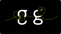
We were particularly surprised by the elaboration of individual small details that, at first glance, were not obvious. For example, the unique form of the letter "g" in the Latin alphabet. It appeared during the first iterations and was preserved in the final version of the font. Alona Korolova
From our side, we want to thank AlfaBravo’s professionals who worked extensively to analyze the fonts used in all our products and reviewed all our ideas, proposals, and wishes.
Collaborating with AlphaBravo's professionals to create one of the key elements of our identity was a fantastic and wise decision. Alona Korolova
Ukrainian identity
The decision to partner with AlphaBravo also came from our desire to give back to the Ukrainian community. In particular, we wanted our Fixel to have a strong connection to Ukraine’s national symbols. AplhaBravo has always been a strong voice in promoting Ukrainian culture in the digital space, so choosing this font studio was the right choice. As a result, Fixel Font has a special symbol — Ukraine’s tryzub inspired by Nil Khasevych.

We are proud that the new Fixel and Hoover fonts are the result of the work of Ukrainian designers, which once again shows what talented people live near us, and when we work together, we definitely achieve our goals.
- Oleksandr Ageev, Chief Design Officer at MacPaw
Releasing Fixel to the world
A crucial milestone in the font development process was the decision to release Fixel to the public, making it free to use. “We decided to distribute the Fixel font for free to support the design community during this difficult time and to receive valuable feedback about our work,” explains Oleksandr Ageev. For the external release, we had to ensure the highest quality and highlight the finest details.
It was a fantastic and right decision to share the font with the community. Our brand communication now appears more consistent and recognizable with our unique corporate fonts.
- Alona Korolova
After the release, we've already observed Fixel Font being utilized in various places, such as Mediamaker and Drukarnia.
To demonstrate the Fixel typeface is the new basic font to help creators with any task, we asked designers at OFFF in Barcelona to take a quiz to see if they can sport the difference between Fixle and popular logos.
You can download Fixel Font for free at https://fixel.macpaw.com/. The website also lets you play with the font.
Conclusions
We have been working on this project for more than two years. During that time, the MacPaw x AlfaBravo teams exchanged countless fonts and character sets, refined the design, and created a sense of cohesion between the two typefaces.
The end result was the successful development of Fixel and Hoover fonts. Hoover and Fixel already reflect our Purpose - We befriend people with technology. Hoover Font is more playful and emotional and represents the human part, while Fixel Font is geometric, universal, and reflects the tech part.
To sum up, the practical idea behind Fixel and Hoover was to refresh the company's identity, unify styles, and improve communication, but we also created something that we are proud to share with the design community. The journey is far from over. We are adding even more functionality to our typefaces, including italics and so much more, so stay tuned!