Bringing Life to User Experience Through Characters

- #Product Design
- #Setapp
• 4 min read
The most memorable experiences are rooted in genuine emotion, yet in the digital realm, too often, software feels impersonal. To bring life and narrative into the user experience, companies come up with brand characters.
This was our approach at Setapp, and as our product improved, we recognized the need to change from our original cast to a new set.
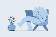
Enter the Rombmen: a family of six distinct, playful, and vibrant mascots. They are far more than adornments to our landing pages and marketing materials—they are the joyful and friendly companions that connect our users with the creators behind the scenes.
Who are the Rombmen?

The Rombmen are a family of six unique, geometrically-inspired characters that serve as playful mascots for Setapp. Each Rombman embodies our spirit through its shape and personality, designed to be a friendly companion for our users.
Though now they have 6 different geometric shapes, it all started with a rhomb. Let's explore the Rombmen journey, from the initial concept to the final implementation.
From sketches to personalities
In 2021, Setapp statement evolved into "Think tasks, not apps". This change led to a revision of the visual style and updating the existing product characters.

We redesigned the main landing page and updated all product and web icons, bringing them to a single consistent style. After that, we felt compelled to renew illustrations style, because the existing one didn't match other visual components. We needed to find a new character that would correspond to the new concept.
And so, the first Rombman was drawn. Born from a simple rhombus shape, Rombman representated Setapp's modular logo adopting its form. Initially created for the SMM Quiz, it symbolized the simplicity and adaptability at the core of Setapp's service.
Soon, Rombman was no longer a solitary figure. The character system expanded with the addition of two geometric buddies - a square and a triangle. This geometric trio harmonized seamlessly with Setapp's product design, characterized by flat colors and a modular system.

Over the next several months, our Design Service navigated through cycles of research, sketching, presentation and feedback. These are only a few variations we came up with.

The latest iteration in Setapp's visual evolution was a transition to a vector style. Previously, we utilized a hand-painted texture for our characters to emphasize their lively and humanistic qualities. However, to align more closely with practical needs and maintain consistency across various applications, we shifted our focus to more streamlined vector graphics.
As a culmination of our work, we crafted six distinct Rombmen. The final concept matched the visual of the main landing page: The stiсkers with tips were transformed into body shapes of the characters.

Constructor
During the first iteration, we already introduced the Rombmen on social networks, where they were met with smiles and shares.
To empower this connection, we needed to allow the marketing team to quickly gather visuals themsleves, without reaching out to design service every time. So we created a constuctor: a tool-kit with 145 illustrative templates, which could be joined together for a ready visual.

Guide
To finalize the project, we compiled an illustration guide. This guide includes rules and tips for any designer who would like to create their own visual with Rombmen. It covers everything from characters' proportions and color combinations to Procreate brush settings.

Conclusions
The overall work on new characters lasted for about a year. During this time we have made several hundreds of sketches and implemented Rombmen in the web, app, social networks and merch.
Since it is not something physical, it is important to make your product personalized. In this case, the Rombmen characters can give users the feeling that they are interacting not with something soulless, but with the people who stand behind the development process.


