Anastasiia Kyiashko Product Lawyer 
Maryna Henyk Product Lawyer
Dark Patterns in Design
- #Dark Patterns
• 19 min read
At times, it feels like it’s becoming harder to capture consumers' attention for a product or service. As a result, many businesses have turned to deceptive design UI and UX tactics, often referred to as dark patterns.
These tactics are used to deceive or coerce users into making choices that benefit businesses but often harm the users themselves. While dark patterns may lead to short-term gains, they come with ethical concerns and potential legal consequences.
This article explores the role of dark patterns in design, how they are regulated, and why businesses should avoid using them despite the temptation.
Dark patterns in the eyes of the law
While the term 'dark pattern' lacks a formal legal definition, various existing laws and regulations address aspects of this manipulative design practice. EU's Data Act presents one of the most laconic interpretations: ”Dark patterns are design techniques that push or deceive consumers into decisions that have negative consequences for them.”
Legal scrutiny of dark patterns is increasing, with both the U.S. and the EU implementing regulations to combat deceptive online practices. In the U.S., laws like the FTC Act and ROSCA target unfair consumer manipulation, while the EU has directives like the GDPR and Digital Services Act that specifically prohibit misleading designs that undermine users' ability to make informed choices.
Read more about regulatory landscape in the U.S. and the EU
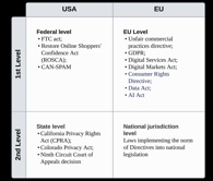
The United States of America
Federal level:
-
FTC Act: FTC Act, particularly through Section 5, addresses dark patterns by targeting any unfair or deceptive practices that mislead or harm consumers. The FTC's ongoing enforcement and guidance increasingly focus on combatting the use of manipulative design in online platforms and services.
-
Restore Online Shoppers' Confidence Act (ROSCA): ROSCA specifically targets certain dark patterns, particularly those related to deceptive billing practices and hidden fees. ROSCA addresses manipulative online practices by ensuring transparency in transactions, especially when it comes to subscriptions and automatic renewals. It ensures consumers are not misled into ongoing charges or subscriptions through deceptive or manipulative online practices (like “hidden fees", "preselection", "forced continuity", and "Roach Motel”).
-
Controlling the Assault of Non-Solicited Pornography and Marketing Act (CAN-SPAM Act): The CAN-SPAM Act combats dark patterns related to email marketing by requiring accurate information in subject lines and headers, providing clear opt-out mechanisms, and prohibiting misleading or manipulative marketing practices.
State level:
- Dark patterns are regulated at the state level in the U.S. primarily through laws like the California Privacy Rights Act (CPRA) and the Colorado Privacy Act, which prohibit the use of deceptive interfaces that manipulate user consent, especially around data privacy. The Ninth Circuit Court of Appeals has also contributed to regulating dark patterns by setting legal precedents that deem misleading online practices as violations of consumer protection laws.
The European Union
-
Unfair Commercial Practices Directive (UCP Directive): The UCP Directive prohibits unfair commercial practices affecting consumers’ economic interests before, during and after the conclusion of a contract. The European Commission has issued a guidance confirming that dark patterns fall within the scope of the UCP Directive. UCP Directive prohibits unfair commercial practices under Article 5, misleading practices under Articles 6 and 7, aggressive practices under Articles 8 and 9 (for example, subscription traps, trick questions, misleading free samples).
-
General Data Protection Regulation (GDPR): Some behaviors associated with dark patterns are explicitly prohibited under the GDPR. For instance, the GDPR requires that consent for data processing must be informed, freely given, and explicit. However, dark patterns often result in "forced consent" or "bundled consent," where users are manipulated into agreeing to extensive data collection. Such practices violate GDPR principles and can lead to significant penalties
-
Digital Services Act (DSA): DSA explicitly prohibits the use of dark patterns by online platforms in Article 25. It specifies that "providers of online platforms must not design, organize, or operate their online interfaces in a manner that deceives, manipulates, or otherwise significantly distorts or impairs the ability of users to make free and informed decisions." Additionally, Article 3 defines an “online interface” as “any software, including a website or part of it, and applications, including mobile applications.”
The DSA makes it clear that it doesn't apply to practices already covered by the GDPR and the UCP Directive, giving priority to those laws. If an online platform's dark pattern violates the GDPR, the national data protection authority will handle it under GDPR rules, not the DSA. Examples of dark patterns can be found in the European Data Protection Board Guidelines 3/2022 (EDPB Guidelines). Similarly, if a practice breaks national laws under the UCP Directive, those laws will be enforced by consumer protection authorities. -
Digital Markets Act: Article 5(2) prohibits combining personal data across different services without user consent and this way protects users from being misled or pressured into sharing more data than they intended, which can be seen as addressing dark patterns related to "bundled consent" or "forced consent." Article 6(2) prohibits making it unnecessarily difficult for users to unsubscribe or stop using a service, which aligns with the prevention of dark patterns such as "hard to cancel" or "Roach Motel".
-
Data Act: Recital 34 clarifies that businesses should avoid using dark patterns when designing digital interfaces, particularly those that manipulate consumers into sharing more data. Instead, businesses must adhere to the data minimization principle outlined in the GDPR.
-
Consumer Rights Directive: Article 6 requires clear information before contracts, targeting misleading practices. Article 8 mandates explicit consent for payments, preventing preselected options. Article 22 prohibits additional payments through pre-ticked boxes, tackling the "preselection" dark pattern. Article 16 ensures clear communication about withdrawal rights, addressing difficulties with cancellations (e.g., "Roach Motel"). Article 21 prevents cost barriers for contacting customer service, safeguarding against obstructive tactics.
-
AI Act: The AI Act emphasizes the ethical use of AI, including how AI-driven tools can contribute to the use of dark patterns. Its goal is to ensure that AI systems do not take advantage of user vulnerabilities, striking a balance between innovation and consumer protection.
The Act bans the use of dark patterns in AI systems. AI can create sophisticated dark patterns that are harder to recognize. When AI is designed with dark patterns embedded in its learning process, it can gradually influence a user’s behavior, leading them to believe their decisions are self-driven, even though they are shaped by the AI.
How much could dark patterns cost?
Epic Games paid $245 million to settle charges that they were using deceptive patterns in Fornite’s payment system.
Diet app Noom paid $62 million to settle charges that they were using deceptive patterns in their subscription and auto-renewal practices.
AT&T paid $105 million to settle charges that they were adding unauthorised fees for services onto customers' phone bills, without their knowledge or consent.
The French data protection authority fined a big tech company €150 million for use of dark patterns which allowed users to accept cookies easily whilst the refusal involved several steps encouraging acceptance out of frustration.
Certain dark patterns and how to avoid them
Dr. Harry Brignull and his team, specialists in UX, have compiled over 400 cases of dark patterns, categorizing them into several distinct types:
-
hidden costs
-
fake urgency (fake countdown timers/ limited offer)
-
hard to cancel / “Roach Motel”
-
misleading act
-
nagging
-
confirmshaming
-
forced action
-
preselection
-
visual interference
Hidden costs
A retailer advertises a product at an enticingly low price, luring you in. As you invest time customizing your selection and progressing through the purchase process, the true cost remains concealed. Only at the final checkout stage does the website reveal previously undisclosed fees, surcharges, or mandatory add-ons. These hidden costs significantly inflate the final price, often far beyond your initial expectations.
This tactic exploits the psychological principle of commitment: having invested time and effort, you're more likely to complete the purchase despite the unexpected price increase. It's a manipulative design choice that obscures the true cost until you're emotionally committed to the transaction.
Instead: Be transparent about all costs from the beginning. Clearly display all costs (including taxes, shipping, and additional fees) early in the checkout process, ideally as soon as the customer adds an item to their cart. Provide a breakdown of the total cost on the cart page and update it in real-time as the user makes changes, so there are no surprises at the final step.
Fake urgency
The "fake urgency" dark pattern creates a false sense of time pressure, like showing countdown timers or messages saying "only a few items left!" to push users into making quick decisions. It tricks people into acting fast, even when the urgency isn’t real.
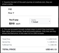
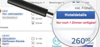
Booking has been criticized for using the dark pattern of "fake urgency" to pressure users into making quick decisions. This tactic involved displaying messages such as "Only 1 room left!" or "Booked 5 times in the last 24 hours!" to create a sense of scarcity or high demand. The goal was to push users into making a booking without having the time to fully evaluate their options, fearing that they might miss out.
Another prominent example goes with the Shopify app "Hurrify". It allowed sellers to generate fake urgency messages, including a fake countdown timer. In the first image, you can see what a typical user experiences on a site using the Hurrify timer — a prominent, animated display claiming the sale ends when the timer hits zero.
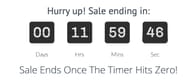
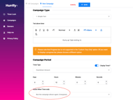
However, in the admin interface for sellers, the default setting is to "Run the campaign all over again," meaning the timer simply resets when it reaches zero.
As of April 2023 Hurrify was banned from the Shopify app store, however beware - there are plenty of similar apps.
Instead: Focus on providing honest and transparent information about product availability or promotions. Display real-time inventory updates that reflect the actual stock of a product, without exaggeration. Use clear messaging for time-sensitive deals, such as: "This offer is valid until [specific date]," without resetting timers or creating false deadlines. Avoid manipulative phrases like "only a few left!" unless it’s truly accurate, and clearly state if a sale or offer is recurring or long-term.
Hard to cancel / “Roach Motel”
The "hard to cancel" or "Roach Motel" dark pattern makes it easy to sign up for a service but difficult to cancel.
The New York Times has faced criticism for using the dark pattern known as "hard to cancel" in its subscription process. This dark pattern involves making it difficult for users to cancel their subscriptions, often by requiring them to go through additional steps or navigate a complex process.
While subscribing to the New York Times is straightforward and can be done online with a few clicks.
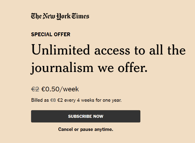
Canceling the subscription is much more complicated. Users often have to contact customer service via phone or live chat to cancel, rather than simply using an online cancellation button or form. This extra friction is designed to discourage users from unsubscribing by making the process inconvenient and time-consuming.
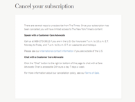
Instead: Provide a simple, transparent, and accessible way to manage cancellations. For example, offer a clear "Cancel Subscription" button directly on the user's account page, send a confirmation email after the cancellation is processed, clearly stating that the subscription has been canceled and providing any relevant details about future charges (if applicable).
Misleading act
The "misleading act" dark pattern tricks users by presenting options or information in a deceptive way. For example, a button might look like it does one thing, but actually leads to an unwanted outcome, misleading users into taking actions they didn't intend.
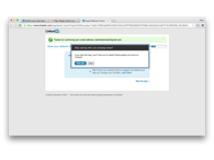
WetterOnline has been criticized for using the "misleading consent" dark pattern, as shown in the cookie consent interface highlighted in the image. This dark pattern manipulates users into consenting to cookie use and data collection in a way that is not transparent or user-friendly.
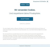
Here's how the "misleading act" dark pattern works:
Unequal Presentation of Choices. WetterOnline makes the "Accept" button highly prominent, encouraging users to quickly accept all cookies without considering the consequences. On the other hand, the "Settings" button, which allows users to customize their preferences or refuse cookies, is smaller, less obvious, and requires extra steps to access. This imbalance subtly pushes users toward accepting cookies rather than managing their preferences.
Misleading "X" Button. The "X" button, typically understood as a way to close a pop-up without taking action, is connected to the "Accept" option. This means that when users try to close the consent window by clicking "X," they are unknowingly agreeing to all cookies, even though they might think they are declining or postponing a decision. This deceptive design misleads users into giving consent when they might not have intended to.
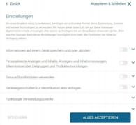
Confusing and Complex Customization Process. If users do choose the "Settings" option to manage their cookie preferences, they are taken to a more complicated interface with multiple sliders for different types of data usage (as seen in the second image). This added complexity can overwhelm users and discourage them from taking the time to properly adjust their settings. Additionally, the "Accept All" option is made more prominent than the "Save" option, again nudging users toward full acceptance.
Instead: Provide clear, transparent, and equally accessible options for consent. Present both "Accept" and "Deny" buttons prominently and equally in size, color, and placement, making it easy for users to make a balanced choice. Ensure the "X" button only closes the pop-up without triggering consent, allowing users to exit without being forced into making an immediate decision. When offering a "Settings" option, make the customization process straightforward and simple, without overwhelming users. Clearly label options, and make sure the "Save" button is just as prominent as any "Accept All" option. Include a short, clear explanation of what data is being collected and why, so users can make an informed decision about their privacy preferences.
Nagging
The "nagging" dark pattern involves repeatedly interrupting users with pop-ups or notifications, pressuring them to take a certain action, like subscribing or upgrading. It disrupts the user experience and pushes them to do something they might not want to.
For instance, Instagram was spotted persistently prompting users with notifications or pop-ups to take specific actions, such as turning on notifications, linking their Facebook account, or switching to a business account.
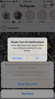
Instead: Show the prompt only once or twice and provide an easy option for users to dismiss it permanently. Include a clear “no thanks” button that immediately stops further reminders on the topic. An even better approach is to display the pop-up in the bottom right or left corner of the screen, allowing the customer to continue what they’re doing without interruption.
Confirmshaming
"Confirmshaming" is a dark pattern where a website or app tries to guilt you into taking a specific action by wording the decline option in a way that makes you feel bad, like "No, I don’t want to save money." It manipulates your emotions to push you toward saying yes.
Taking for example eCommerce platform MyMedic - when a user was browsing the site, there appeared a pop-up offering to sign up for sales/discounts notifications with two options: one to accept the deal, and the other to decline. However, the decline option was often phrased in a guilt-inducing way, such as “No, I prefer to bleed to death” or “No, I don’t want to stay alive”. This type of language at least made users feel uncomfortable.
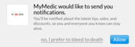
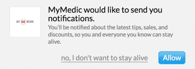
Both decline alternatives turn a simple "No" into scary, life-threatening statements, adding a macabre tone to an otherwise normal prompt.
Other examples of confirmshaming are phrases like “No, thanks, I want to pay a full price”, or “If you press “no” It will make harder to us to tailor content for you”.
Instead: Provide neutral and respectful choices. Use a clear, straightforward decline option like "No, thanks" without further explanation of how this choice may influence the user experience.
Forced action
The "forced action" dark pattern occurs when a website or app requires you to do something unrelated to your goal before you can proceed, such as signing up for a newsletter before making a purchase. It forces users into actions they might not want to take in order to continue.
When users signed up for a LinkedIn account, the platform prompted them to import their email contacts to invite connections. While this seemed optional, LinkedIn often made it difficult for users to bypass this step, creating a sense that importing contacts was required to proceed. In some cases, users had accidentally sent connection invites to their entire email list without intending to do so. Additionally, LinkedIn had pressured users to provide more personal details and professional data to complete their profile, linking this to unlocking full platform features.
Instead: Rather than requiring users to complete unrelated actions to proceed, provide optional steps that are easy to skip or decline. Ensure that additional actions, like filling out profile details, are optional and not mandatory to access the core features of the platform.
Preselection
The "preselection" dark pattern occurs when websites or apps automatically choose options for users, such as pre-checking a box for an additional service or feature.
Famous example is the Trump campaign in 2020. This involved automatically pre-checking boxes that committed donors to making recurring payments, often without their explicit awareness. Later in the campaign, they introduced a second preselected checkbox that misled users into making an additional donation.
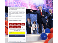
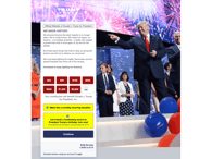
Instead: Ensure all checkboxes for additional services, donations, or subscriptions are unchecked by default, allowing users to actively choose what they want.
Visual interference
The "visual interference" dark pattern uses distracting or confusing design elements to hide important information or make certain actions harder to find.
In 2019, Tesla introduced an eCommerce feature to their mobile app, enabling Tesla owners to purchase vehicle upgrades, such as the autopilot feature that unlocks "Full Self-Driving" capabilities for $4,000. Some customers accidentally made this purchase and were furious when they found out that Tesla refused to issue refunds. A notice regarding the non-refundability was posted, but it was so subtle that many users overlooked it and simply failed to see it.
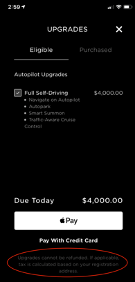
Instead: Make important notices, such as refund conditions or additional charges, highly visible and easy to read, using clear fonts and prominent placement.
Conclusions
As businesses push the boundaries of UI/UX design to capture consumer attention, the line between persuasion and manipulation can become blurred. Dark patterns, though seemingly effective in the short term, come with long-term costs—not only in terms of legal risks but also in user trust and brand reputation.
By focusing on transparent and ethical design practices, businesses can enhance user satisfaction while staying compliant with emerging regulations. In the end, deceptive patterns may gain attention, but they ultimately erode the very trust needed for lasting success in the digital age. The lesson is clear: build better experiences, not dark patterns.
Disclaimer: any analysis in the article should not be construed or interpreted as legal advice. This is an independent publication and has not been authorized, sponsored, or otherwise approved by any of the aforementioned trademark owners.